At this time I am experiencing a high influx of new clients and am booked solid for the next few months.
Please check back later to book your consultation.
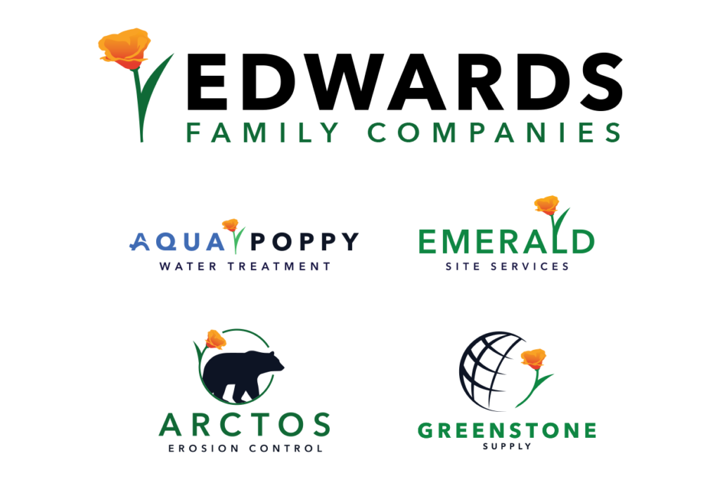
Edwards Family Companies was made up of several smaller businesses, each with its own purpose, but lacking visual cohesion. Their logos felt disconnected, and there was no overarching identity to tie them together as part of one family of brands. They needed a full redesign of each individual logo and a new group identity that could unify everything while still allowing each brand to stand on its own.
The Solution
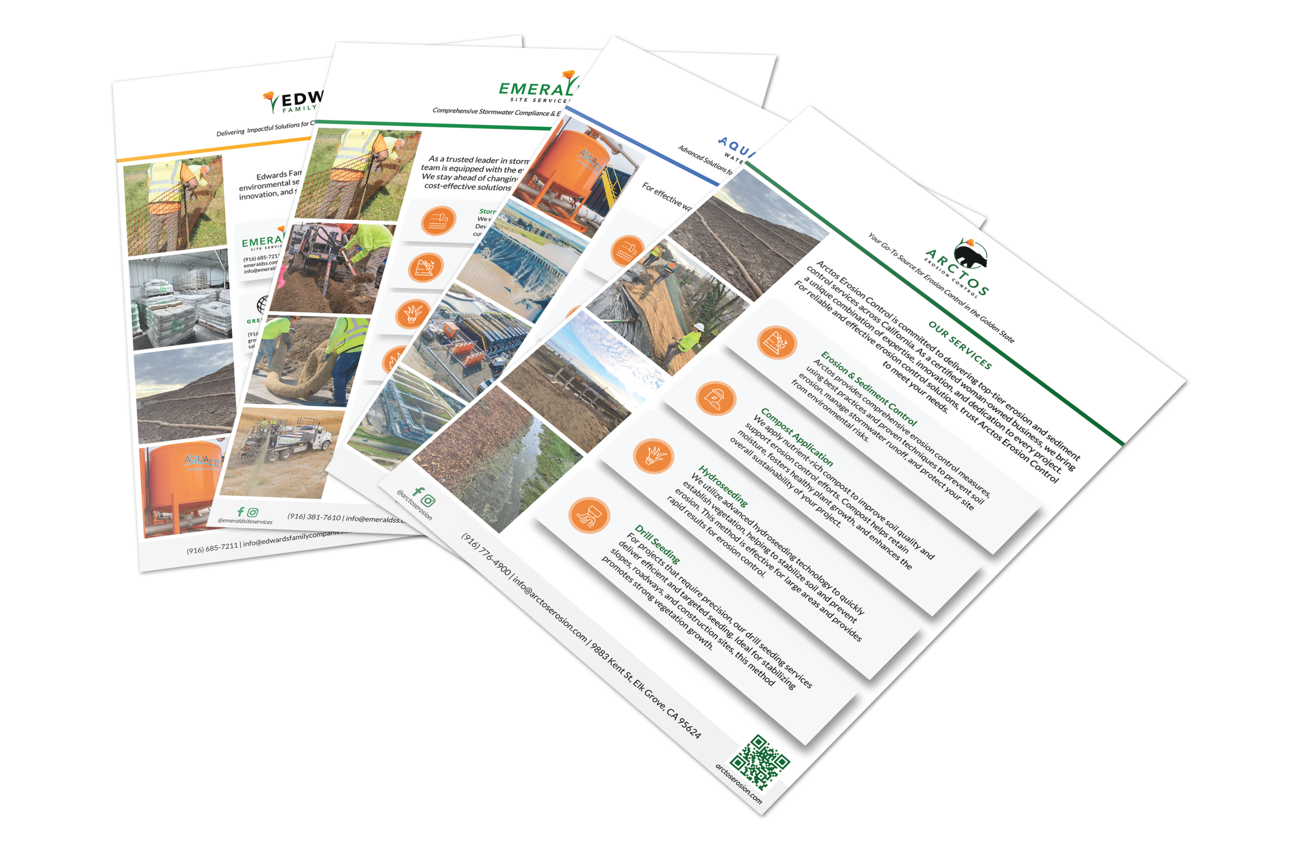
I began by redesigning the logos for each of the sub-companies, making sure every mark was distinct but visually related. Once those were established, I created a new parent logo for Edwards Family Companies that brought them all together with shared style, tone, and structure. Finally, I designed a set of one-page overviews for each company, consistent in layout and typography, but tailored in color, iconography, and content to reflect each business’s focus.
The Result
Edwards Family Companies now has a clear, cohesive identity across all their businesses. Each brand has space to express its unique focus, but together they feel like part of a well-structured system. The new logos and materials support better communication, internal organization, and a stronger public-facing brand.
Deliverables
• Logo redesigns for each sub-company
• Parent brand logo and identity
• Unified visual system and hierarchy
• Company overview one-pagers
Ready for Beautiful Design?
Leave your information and I will be in contact soon.
modal
"*" indicates required fields
*During normal business hours. After hours calls will be returned the next business day.